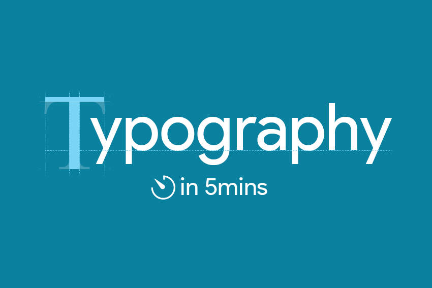
A Beginner’s Guide to What is Typography and How to Use It
Typography is one of the most powerful tools in a graphic designer's toolkit. It is far more than just choosing "pretty fonts"—typography is the art and technique of arranging type to make written language legible, readable, and visually engaging.
Whether you are designing a concert poster, a corporate logo, or a modern website, understanding typography is what sets the tone, mood, and personality of your work.
What is Typography?
Typography is the strategic use and arrangement of typefaces, sizes, spacing, and alignment to create visual harmony and balance.
Great typography does two things simultaneously:
It guides the viewer’s eye seamlessly through the information (Visual Hierarchy).
It communicates emotion and context before the reader even processes the literal words.
As an essential pillar of graphic design, typography works hand-in-hand with color theory, grid layouts, and imagery to build cohesive brand identities.
Why it matters: The right font choice can make a brand look modern, elegant, or bold. The wrong choice can completely distort your message and alienate your audience.
The Core Pillars of Typography
To master typography, every student needs to understand three fundamental concepts:
1. Font Families (Typeface Categories)
Fonts are generally grouped into distinct families, each carrying its own psychological weight and style:
| Font Type | Characteristics | Best Used For | Example |
|---|---|---|---|
| Serif | Traditional, authoritative, features small "feet" at the ends of strokes. | Print media, books, editorials. | Times New Roman, Georgia |
| Sans-Serif | Modern, clean, geometric, no "feet". | Digital screens, websites, mobile apps. | Arial, Helvetica, Inter |
| Display / Script | Decorative, unique, mimics handwriting or bold styling. | Logos, headlines, creative posters. | Pacifico, Montserrat Bold |
2. Typographic Hierarchy
Hierarchy dictates the order in which a viewer processes information. By varying size, weight (bold vs. light), and placement, you tell the reader's brain what is most important.
Heading (H1): Big, bold, and attention-grabbing.
Subheading (H2): Medium size, provides context.
Body Text: Smaller, highly legible, meant for comfortable reading.
3. Spacing and Alignment
How you position your text matters just as much as the font itself:
Leading: The vertical space between lines of text.
Kerning: The space between individual characters.
Tracking: The uniform spacing across a whole word or paragraph.
Secret to Getting Better Design Clients
For anyone learning graphic design—whether you are studying at a local university, attending a tech bootcamp, or teaching yourself online—mastering typography is non-negotiable.
With the rapid growth of the digital economy, local brands, startups, and creative agencies are constantly looking for designers who can create international-standard visual identities. Moving past default system fonts and understanding the mechanics of type is the ultimate secret to making your portfolio stand out, look professional, and command premium rates.
Your next steps: Start by observing the world around you. Notice the billboards along the highway, the packaging of your favorite products, or the layout of your favorite apps. Study their font families, contrast, and hierarchy, and you will quickly boost your potential for typography in your design career.
Discussion
0 Comments